Case Study
01 / Cert Lane
Website UX / Information Architecture / Brand Uplift
Role /
UX Lead & Interface Designer
-
UX strategy
Website audit
Information architecture
Sitemap development
Customer pathways
User flows
Wireframes
Website UI design
Brand uplift
UI component system
Accessibility review
Developer-ready design direction
The Challenge
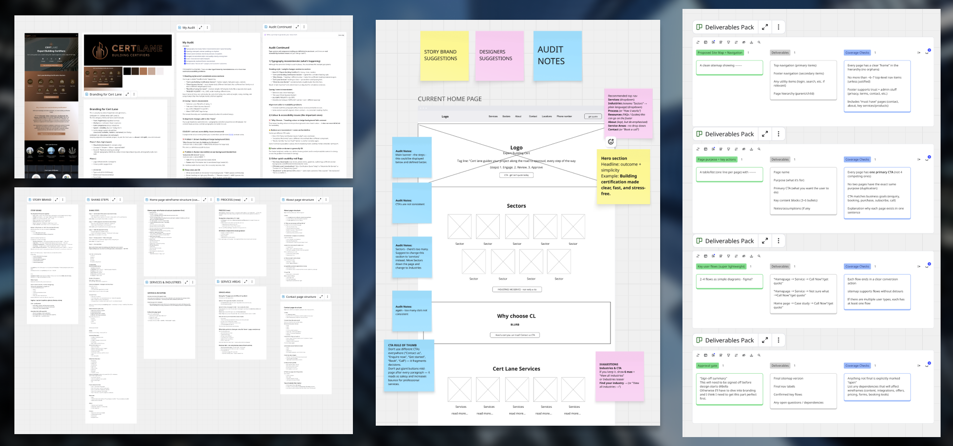
Cert Lane offers several certification and consultancy services across different industries. However, the original website was structured around internal service terminology rather than the needs and questions of the customer.
This created several challenges:
Users were expected to already know which certification or service they required.
Service descriptions relied heavily on technical terminology.
Navigation did not provide clear pathways for different customer types.
The website lacked a strong explanation of Cert Lane’s process and value.
Important decision-making information was difficult to locate.
The existing visual experience did not fully reflect the expertise or professionalism of the business.
The website needed to become more than an information source.
It needed to act as a clear, supportive guide for customers who may be unfamiliar with certification requirements.
Information Architecture
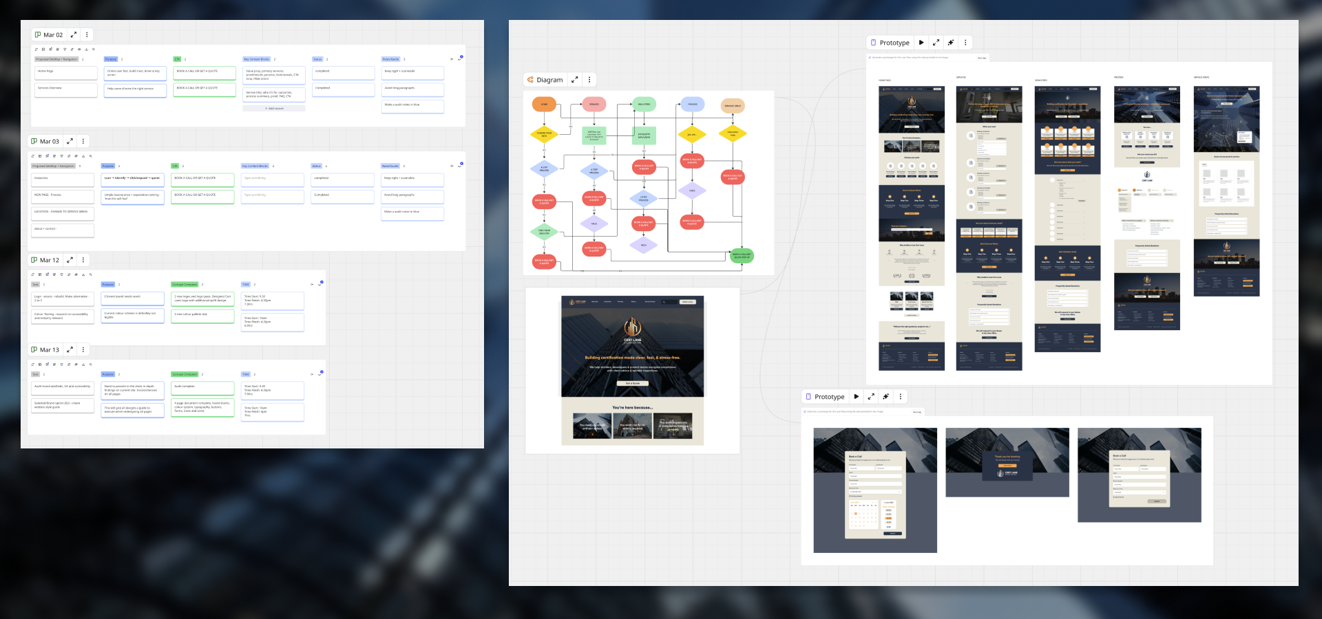
The sitemap was restructured to create clearer pathways through the website.
Services were supported by industry pages, educational content and a dedicated process page. This allowed users to explore the website based on what they already understood, rather than forcing everyone through the same journey.
The revised structure focused on:
Clearer separation between services and industries
Reduced navigation complexity
Stronger page hierarchy
More visible enquiry pathways
Supporting content for customers who needed reassurance
Better connections between related services and industries
A logical journey from discovery through to enquiry
User Flows & Wireframes
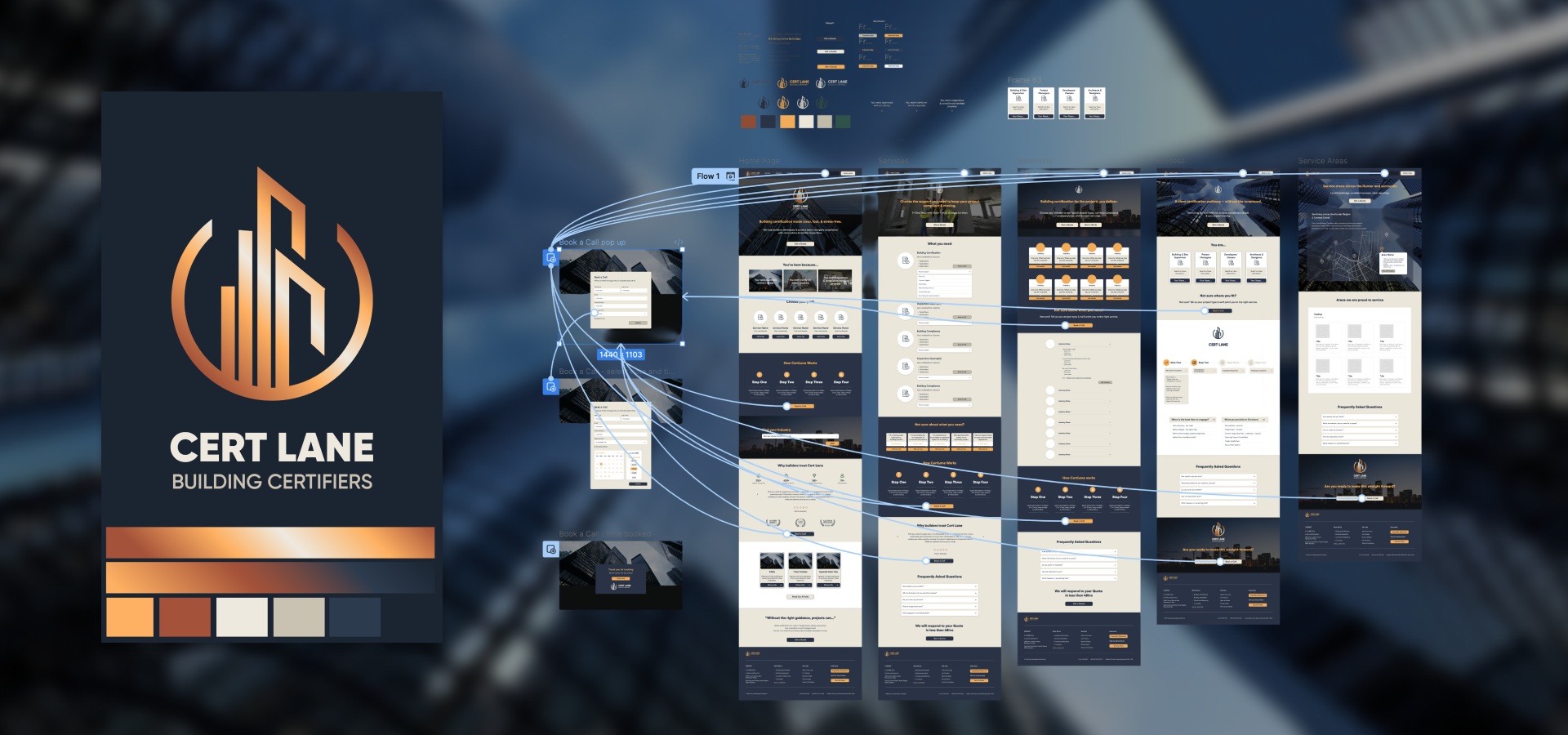
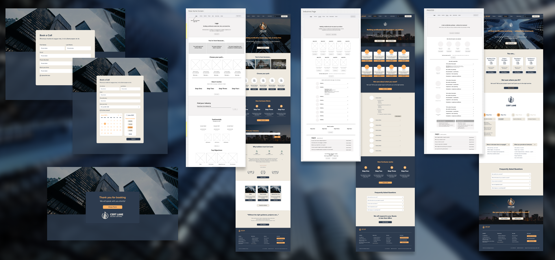
Wireframes were developed to test the structure, content order and user journey before visual design began.
Each page was planned around the questions a customer was likely to ask:
Is this service relevant to my business?
What does the process involve?
What information will I need?
Why should I work with Cert Lane?
What happens next?
The wireframes established a consistent page rhythm, prioritising clear headings, concise explanations, relevant proof points and visible calls to action.
This allowed the content and customer experience to be resolved before visual styling was introduced.
Brand & UI Uplift
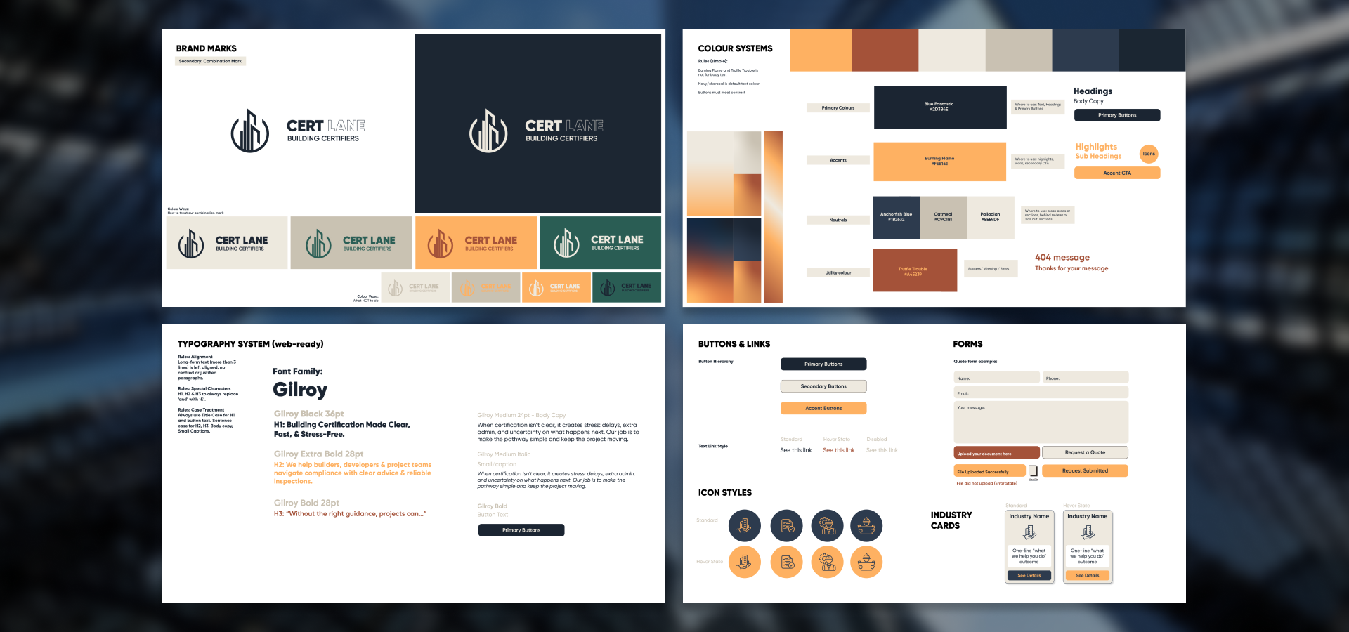
The visual direction was refined to present Cert Lane as knowledgeable, professional and approachable.
The website UI introduced a clearer visual hierarchy and a more consistent design system across:
Typography
Buttons
Forms
Cards
Service and industry modules
Iconography
Spacing
Navigation
Calls to action
The design retained the existing brand foundations while creating a more contemporary and credible digital experience.
Accessibility & Usability
Accessibility and usability considerations were integrated into the design process rather than treated as a final check.
The interface considered:
Legible typography and text sizing
Clear contrast
Consistent heading hierarchy
Predictable navigation
Descriptive button labels
Scannable content sections
Clear form structure
Adequate spacing around interactive elements
Reduced reliance on technical language
The aim was to make the website easier to navigate and understand for a broader range of users.
The Outcome
The final concept transformed the website from a service-led information source into a more customer-focused digital experience.
The new structure gave users multiple ways to find the right information, whether they arrived with a specific certification in mind, an industry-related need or no clear understanding of where to begin.
The result was a clearer and more cohesive foundation for Cert Lane’s website, bringing together customer journey planning, information architecture, wireframing, UI design and brand consistency in one practical system.